Color is one of the most powerful elements in interior design. The colors you choose for your home decor can have a profound psychological impact on your mood, emotions, and behaviors.
Understanding the psychology behind color can help you create a personalized sanctuary that promotes the lifestyle you desire.
How Color Influences Your Psychology
While reactions to color can be subjective, the basis for color psychology stems from natural associations we make between colors and experiences. Warm colors evoke feelings linked to fire and sunlight, eliciting excitement and cheer. Cool colors conjure images of water and sky, creating calming and peaceful moods.
The human eye sees color through light waves that stimulate pigments in the retina. This sends signals to the hypothalamus region of the brain, which regulates emotion and hormone production. When exposed to certain wavelengths of light, nerve endings release chemicals that make us feel relaxed, energetic, or even hungry.
Interior designers manipulate these reactions to color for functional and aesthetic purposes. Your favorite shades can lift your spirits, while colors you dislike can dampen your mood. Leveraging the psychology of color is key to designing a personal sanctuary.
Choosing a Color Scheme
Most designers recommend selecting one or two dominant colors for your main home decor elements like walls, furniture, and window treatments. Accent colors in smaller doses add flair. Here are popular color scheme options:
Monochromatic
Sticking to various shades, tones, and tints of one color creates a calm, cohesive look. Gray is a top choice for monochromatic schemes. Adding texture prevents monotony.
Analogous
Analogous schemes use hues located right next to each other on the color wheel, like blue, blue-green, and green. This creates a harmonious vibe.
Complementary
Complementary color schemes pair opposites on the wheel, like red and green or yellow and purple. This adds visual contrast and vibrancy.
Triadic
Triadic schemes use three colors equally spaced on the wheel, such as red, yellow, and blue. The palette is diverse yet balanced.
Neutral
Neutrals like white, black, gray, and brown offer flexibility. Introduce color through accents and artwork.
Psychology of Color Groups
While reactions are somewhat subjective, general psychological associations can guide your design.
Warm Colors
Yellow, orange, and red are considered warm, inviting, and energetic. These fiery hues ignite excitement and cheer.
Red
Red is the most emotionally intense color. It amplifies energy, passion, and joy. But it can also overstimulate, so use it sparingly. Red works well for dining rooms and home offices.
Orange
Orange embodies the warmth of red and cheer of yellow. It promotes sociability and creativity, great for living rooms and playrooms. But avoid orange in bedrooms as it can be too stimulating.
Yellow
Yellow boosts positivity, clarity, and concentration. While warm shades are energizing, bright yellows can provoke anxiety. Use sunflower and mustard tones for kitchens, laundry rooms, and workspaces.
Cool Colors
Blues, greens, and purples have calming, tranquil effects. These serene shades promote relaxation and reflection.
Blue
Blue is universally beloved and naturally calming. Pale blues are peaceful, while bolder blues feel confident and inspiring. Use blue for bedrooms, bathrooms, and meditation spaces.
Green
Green balances warm and cool properties. Nature greens boost harmony and growth. Avoid dark olive shades which can feel drab. Try green in living rooms, libraries, and home offices.
Purple
Purple mixes stimulating red with tranquil blue. Light lilacs and lavenders reduce stress. But deep purples can seem regal and dramatic. Limit intense purple to accent walls and use lighter tones in bedrooms or reading nooks.
Neutral Colors
Black, white, gray and brown are neutral backgrounds that let other colors pop.
White
Crisp white evokes purity, freshness, and simplicity. All-white schemes feel airy but lack coziness. White works best when balanced with accent colors.
Black
Signature and sleek, black adds modern edge, definition, and opulence. But an all-black room can feel cold and daunting. Mix in metallics and accessory colors.
Gray
A refined neutral, gray combines black and white for a balanced, versatile palette ranging from silver to charcoal. Mix different shades of gray for depth.
Brown
Earthy brown hues represent stability, nature, and comfort. Warm browns work for furniture and wood accents. Avoid flat beige tones.
Using Color Psychology for Room Types
Tailor your color choices to both the mood you want and the room’s purpose.
Living Rooms
As social spaces for entertaining guests, living rooms benefit from warm welcoming tones like terra cotta, mustard, sage green, and sky blue. Add pops of brighter accent colors.
Kitchens
Stimulating shades boost productivity in kitchens, like tomato red, sunshine yellow, and emerald green. But limit intense colors to accents like bar stools or dishware, using neutral whites or grays for cabinetry.
Dining Rooms
Encourage digestion and appetite with contrasting colors like a rich navy blue dining set against a buttery yellow wall. Red also stimulates hunger. Add a bold accent wall for drama.
Bedrooms
Cool tranquil colors relax the body into a good night’s sleep. Try soft blues, lavenders, muted greens, and warm grays. Avoid bright reds and oranges that provide too much stimulation.
Bathrooms
Bathrooms are personal pampering spaces that benefit from soothing spa colors like pale blues, greens, and neutrals. However, red and orange can energize morning routines. Use sparingly.
Home Offices
Boost focus and productivity with cool blues, grassy greens, and mellow yellow tones. Save warm reds and oranges for break rooms. Add pops of color for creativity.
Kids’ Rooms
Stimulate active young minds with vibrant primary colors like red, yellow, green, and blue. Mix in gender neutral grays and patterns for balance. limit intense colors to one accent wall.
Expert Tips for Leveraging Color Psychology
Here are some pro tips for selecting and arranging colors in your home:
- Stick with 2 or 3 colors for cohesion. Too many looks chaotic.
- Use 60% dominant color, 30% secondary color, 10% accent colors for ideal balance.
- Light colors visually expand small spaces, while dark colors feel cozy.
- North facing rooms feel cooler, so use warm tones. South facing rooms suit cool hues.
- Limit intense reds, oranges, and purples to accent walls or artwork pops.
- Add texture and patterns to prevent monotony in monochrome schemes.
- Choose both a color and a finish (matte, satin, gloss) that fits the room function.
- Use lighter tones overhead to give the illusion of high ceilings.
- Ensure adequate lighting to allow colors to be seen accurately.
Achieving Your Ideal Atmosphere
While decorative details matter, color sets the underlying tone of a space. Focus first on choosing a color palette that enhances how you want to feel in each room. The psychology of color can transform the ambience of your home to energize, relax, inspire, or uplift. Leverage this powerful design element to create personal spaces that promote mental and emotional well-being. With strategic color choices guided by psychology principles, your home decor can help you feel centered, productive, and content.
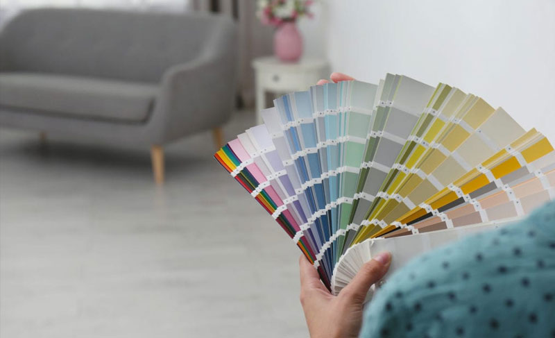
Testing Color Schemes
The impact of colors can be difficult to envision, so many designers recommend testing schemes before committing to a full redesign. Here are easy ways to try colors:
Paint Swatches
Paint store sample cards let you view large swatches of colors on your wall before painting an entire room. Move the cards around at different times of day to see how lighting changes the hues.
Poster Boards
Cut poster boards into large squares and paint each a color you are considering. Lean boards against walls or lay on the floor to give colors prominence.
Digital Visualizers
Online painting apps let you upload room photos and virtually “paint” your space. Test color schemes easily with no mess or commitment.
Fabric Swatches
Order samples of upholstery or drapery fabrics to better envision how accent colors will look in your planned scheme. Many retailers offer free swatches.
Movable Items
Use inexpensive decorative items like throw pillows, vases, and tablecloths to temporarily incorporate colors before investing in larger furniture or rugs.
Achieving Balance and Harmony
A harmonious color scheme requires balancing factors like light/dark, warm/cool, muted/vibrant, primary/secondary in ways pleasing to the eye and mind. Here are tips:
- Use a light ceiling color to balance darker walls and furnishings. This creates an “inverted umbrella” effect opening up the space.
- Anchor a bright focal wall with neutral furnishings and accents. Too many competing colors causes visual chaos.
- In open concept rooms, repeat your main living area colors in the dining space for cohesion.
- Soft, muted paint colors balance vivid art and fabric prints. Don’t overdo intense patterns.
- Distribute color temperatures evenly. For example, a blue accent wall, red sofa, and green plant balance the palette.
Achieving color harmony takes experimentation. But the payoff is a personalized sanctuary reflecting your color preferences.
Additional Color Considerations
Here are a few final tips for leveraging color psychology in your home:
- Colors appear lighter and brighter in sunny south-facing rooms. Account for this by selecting hues a shade darker than you initially prefer. North-facing spaces can handle lighter tones.
- Saturated colors may overwhelm a small room. Stick to neutral walls and add pops of color through small decors and artwork.
- In childrens’ rooms, limit intense reds, oranges and yellows to one accent wall or artwork. Too much high intensity color overstimulates.
- White trims and ceilings keep colorful saturated walls from feeling overpowering. Contrast balances the palette.
- For resale value, avoid personal color preferences that may deter buyers. Stick to popular neutral, gray, and blue schemes.
- Those with color blindness or visual impairments may have difficulty distinguishing certain shades. Keep color contrasts clear.
By thoughtfully planning your home’s color palette using psychology principles, you can curate personal spaces that nurture your health, productivity and satisfaction. Surround yourself with hues that inspire you.